Data wrangling
Following are some examples of how the bagyo dataset can
be used to demonstrate various data wrangling approaches, particularly
those using the tidyverse packages.
Creating summaries
## Get number of cyclone categories per year ----
bagyo |>
  group_by(year, category_name) |>
  count() |>
  group_by(year) |>
  complete(category_name) |>
  ungroup()
#> # A tibble: 30 × 3
#>     year category_name             n
#>    <dbl> <fct>                 <int>
#>  1  2017 Tropical Depression       5
#>  2  2017 Tropical Storm            9
#>  3  2017 Severe Tropical Storm     5
#>  4  2017 Typhoon                   3
#>  5  2017 Super Typhoon            NA
#>  6  2018 Tropical Depression       4
#>  7  2018 Tropical Storm            7
#>  8  2018 Severe Tropical Storm     4
#>  9  2018 Typhoon                   6
#> 10  2018 Super Typhoon            NA
#> # ℹ 20 more rows
## Get yearly mean cyclone pressure and speed ----
bagyo |>
  group_by(year) |>
  summarise(mean_pressure = mean(pressure), mean_speed = mean(speed))
#> # A tibble: 6 × 3
#>    year mean_pressure mean_speed
#>   <dbl>         <dbl>      <dbl>
#> 1  2017          986.       88.0
#> 2  2018          961.       66.7
#> 3  2019          976.       59.0
#> 4  2020          973.       62.0
#> 5  2021          972.       60.3
#> 6  2022          971.       63.1
## Get cyclone category mean pressure and speed ----
bagyo |>
  group_by(category_name) |>
  summarise(
    n = n(),
    mean_pressure = mean(pressure),
    mean_speed = mean(speed)
  )
#> # A tibble: 5 × 4
#>   category_name             n mean_pressure mean_speed
#>   <fct>                 <int>         <dbl>      <dbl>
#> 1 Tropical Depression      32          995.       39.1
#> 2 Tropical Storm           33          988.       56.8
#> 3 Severe Tropical Storm    20          978.       71.8
#> 4 Typhoon                  26          944.       97.7
#> 5 Super Typhoon             8          911.      110
Working with date and time data
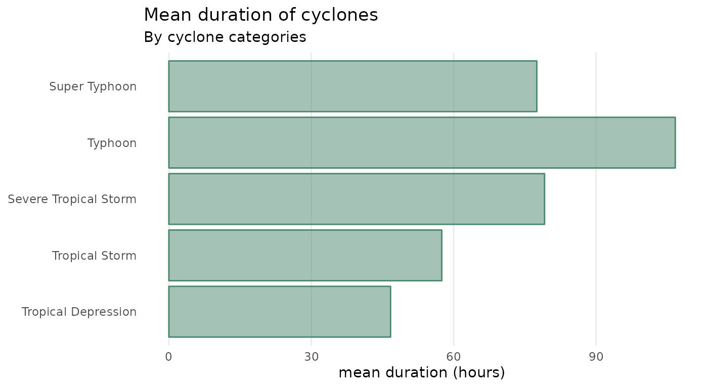
## Get cyclone category mean duration (in hours) ----
bagyo |>
  mutate(duration = end - start) |>
  group_by(category_name) |>
  summarise(mean_duration = mean(duration))
#> # A tibble: 5 × 2
#>   category_name         mean_duration
#>   <fct>                 <drtn>
#> 1 Tropical Depression    46.01562 hours
#> 2 Tropical Storm         60.36364 hours
#> 3 Severe Tropical Storm  80.58333 hours
#> 4 Typhoon               105.37821 hours
#> 5 Super Typhoon          97.06250 hours
## Get number of cyclones per month by year ----
bagyo |>
  mutate(month = month(start, label = TRUE)) |>
  group_by(month, year) |>
  count() |>
  ungroup() |>
  complete(month, year, fill = list(n = 0)) |>
  arrange(year, month)
#> # A tibble: 72 × 3
#>    month  year     n
#>    <ord> <dbl> <int>
#>  1 Jan    2017     1
#>  2 Feb    2017     1
#>  3 Mar    2017     0
#>  4 Apr    2017     2
#>  5 May    2017     0
#>  6 Jun    2017     0
#>  7 Jul    2017     4
#>  8 Aug    2017     2
#>  9 Sep    2017     4
#> 10 Oct    2017     3
#> # ℹ 62 more rows
Data visualisation
Following are some examples of how the bagyo dataset can
be used to demonstrate various data visualisation approaches,
particularly those using the tidyverse and
ggplot2 packages.
Bar plots
## Get cyclone category mean duration (in hours) ----
bagyo |>
  mutate(duration = end - start) |>
  group_by(category_name) |>
  summarise(mean_duration = mean(duration)) |>
  ggplot(mapping = aes(x = mean_duration, y = category_name)) +
  geom_col(colour = "#4b876e", fill = "#4b876e", alpha = 0.5) +
  labs(
    title = "Mean duration of cyclones",
    subtitle = "By cyclone categories",
    x = "mean duration (hours)",
    y = NULL
  ) +
  theme_minimal() +
  theme(
    panel.grid.minor.x = element_blank(),
    panel.grid.major.y = element_blank(),
    panel.grid.minor.y = element_blank()
  )
Scatter plots
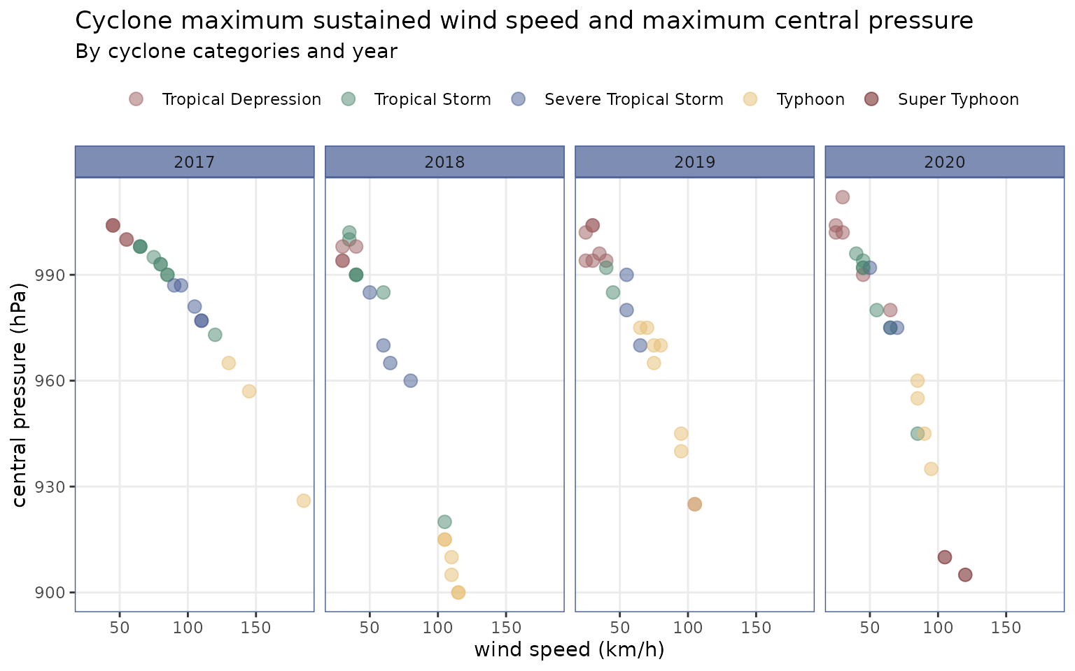
## Cyclone speed by pressure ----
bagyo |>
  dplyr::mutate(year = factor(year)) |>
  ggplot(mapping = aes(x = speed, y = pressure)) +
  geom_point(mapping = aes(colour = category_name), size = 3, alpha = 0.5) +
  scale_colour_manual(
    name = NULL,
    values = c(
      "#9c5e60", "#4b876e", "#465b92", "#e5be72", "#5d0505"
    )
  ) +
  labs(
    title = "Cyclone maximum sustained wind speed and maximum central pressure",
    subtitle = "By cyclone categories and year",
    x = "wind speed (km/h)",
    y = "central pressure (hPa)"
  ) +
  facet_wrap(. ~ year, ncol = 3) +
  theme_bw() +
  theme(
    legend.position = "top",
    strip.background = element_rect(
      fill = alpha("#465b92", 0.7), colour = "#465b92"
    ),
    panel.border = element_rect(colour = "#465b92"),
    panel.grid.minor = element_blank()
  )
bagyo |>
  mutate(
    year = factor(year),
    duration = as.numeric(end - start)
  ) |>
  ggplot(mapping = aes(x = speed, y = duration)) +
  geom_point(
    mapping = aes(colour = year, shape = year), size = 3, alpha = 0.5
  ) +
  geom_smooth(
    mapping = aes(colour = year), method = "lm", se = FALSE, linewidth = 0.75
  ) +
  scale_colour_manual(
    values = c(
      "#9c5e60", "#4b876e", "#465b92",
      "#e5be72", "#5d0505", "#5630d3"
    )
  ) +
  scale_shape_manual(values = c(15:19, 8)) +
  labs(
    title = "Maximum sustained wind speed by duration of cyclones",
    subtitle = "2017-2021",
    x = "speed (km/h)", y = "duration (hours)",
    colour = "Year", shape = "Year"
  ) +
  theme_minimal() +
  theme(legend.position = "top")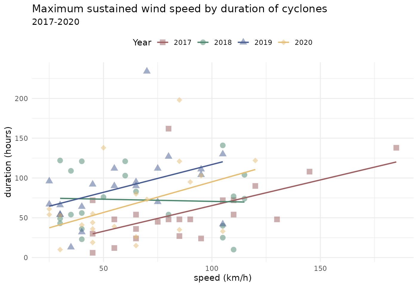
Time series
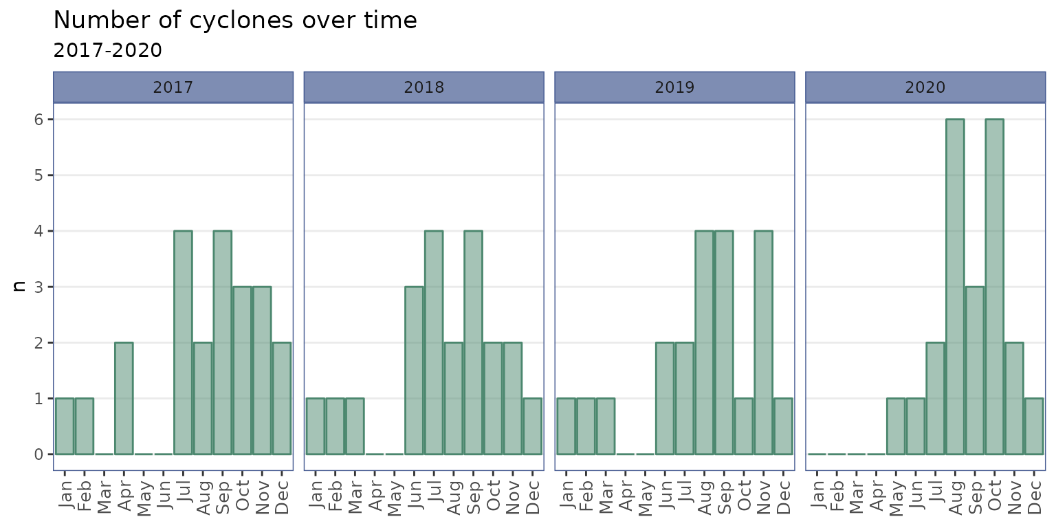
## Get number of cyclones per month by year and plot ----
bagyo |>
  mutate(month = month(start, label = TRUE)) |>
  group_by(month, year) |>
  count() |>
  ungroup() |>
  complete(month, year, fill = list(n = 0)) |>
  arrange(year, month) |>
  ggplot(mapping = aes(x = month, y = n)) +
  geom_col(colour = "#4b876e", fill = "#4b876e", alpha = 0.5) +
  scale_y_continuous(breaks = seq(from = 0, to = 6, by = 1)) +
  labs(
    title = "Number of cyclones over time",
    subtitle = "2017-2021",
    x = NULL,
    y = "n"
  ) +
  facet_wrap(. ~ year, ncol = 3) +
  theme_bw() +
  theme(
    strip.background = element_rect(
      fill = alpha("#465b92", 0.7), colour = "#465b92"
    ),
    panel.border = element_rect(colour = "#465b92"),
    panel.grid.minor.y = element_blank(),
    panel.grid.major.x = element_blank(),
    axis.text.x = element_text(size = 10, angle = 90, hjust = 1, vjust = 0.5)
  )
Distribution plots
bagyo |>
  mutate(year = factor(year)) |>
  ggplot(mapping = aes(x = year, y = speed)) +
  geom_boxplot(colour = "#4b876e", fill = "#4b876e", alpha = 0.5) +
  labs(
    title = "Distribution of tropical cyclone maximum sustained wind speed",
    subtitle = "2017-2021",
    x = NULL, y = "speed (km/h)"
  ) +
  theme_minimal() +
  theme(panel.grid.major.x = element_blank())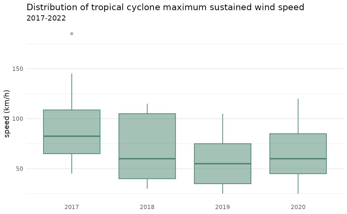
bagyo |>
  mutate(year = factor(year)) |>
  ggplot(mapping = aes(x = year, y = speed)) +
  geom_boxplot(colour = "#4b876e") +
  geom_jitter(
    colour = "#4b876e", fill = "#4b876e", alpha = 0.5,
    shape = 21, size = 2, width = 0.2
  ) +
  labs(
    title = "Distribution of tropical cyclone maximum sustained wind speed",
    subtitle = "2017-2021",
    x = NULL, y = "speed (km/h)"
  ) +
  theme_minimal() +
  theme(panel.grid.major.x = element_blank())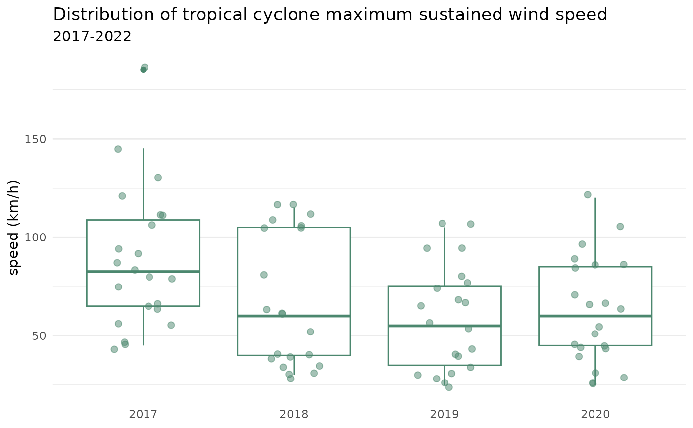
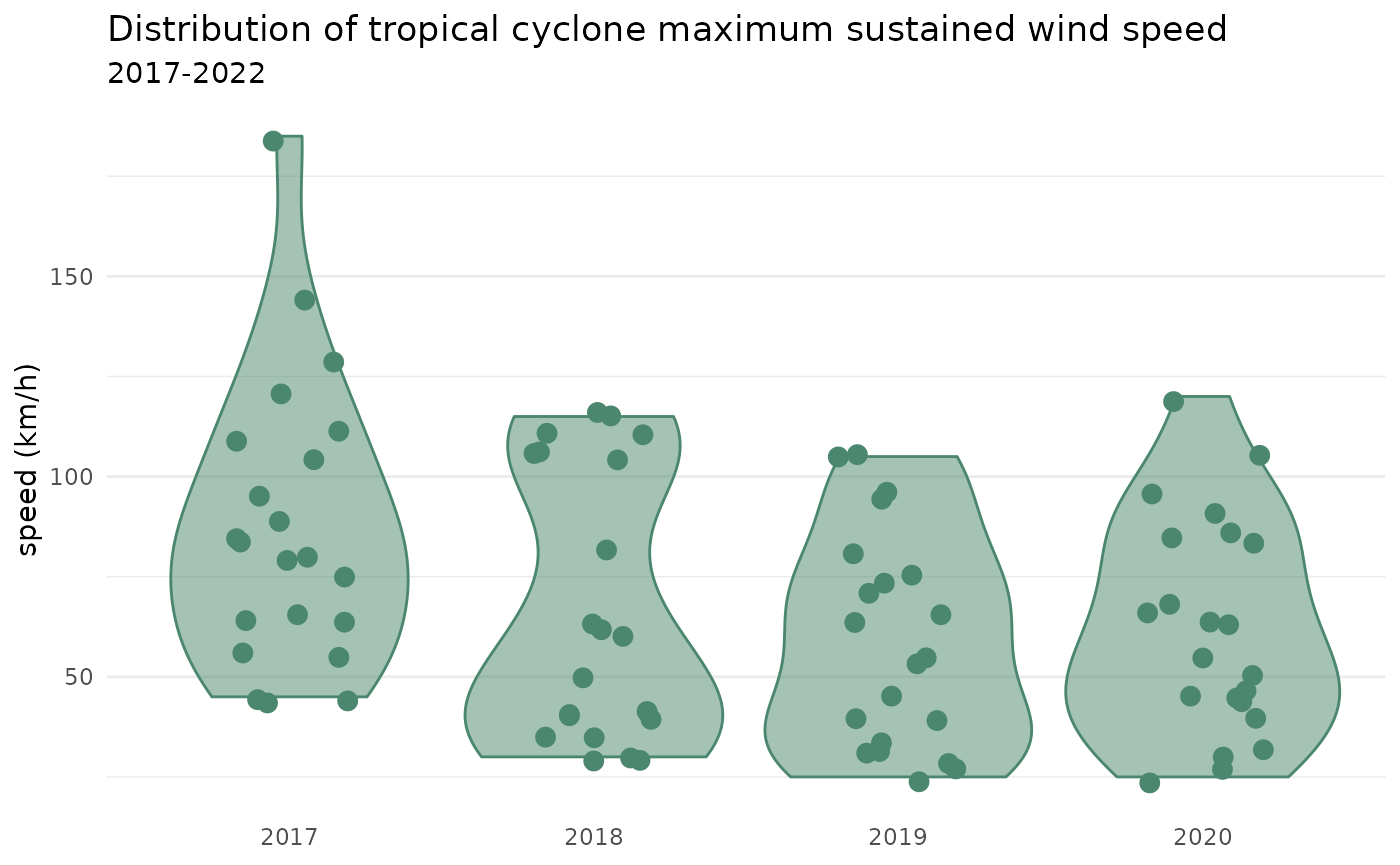
bagyo |>
  mutate(year = factor(year)) |>
  ggplot(mapping = aes(x = year, y = speed)) +
  geom_violin(colour = "#4b876e", fill = "#4b876e", alpha = 0.5) +
  geom_jitter(colour = "#4b876e", size = 3, width = 0.2) +
  labs(
    title = "Distribution of tropical cyclone maximum sustained wind speed",
    subtitle = "2017-2021",
    x = NULL, y = "speed (km/h)"
  ) +
  theme_minimal() +
  theme(panel.grid.major.x = element_blank())